Article · Apr 24, 2026
How to migrate a useState form to React Hook Form and Zod (the real walkthrough)
Step-by-step migration from useState to React Hook Form, Zod, and shadcn Form. Code diffs, validation mode choice, and four gotchas covered.
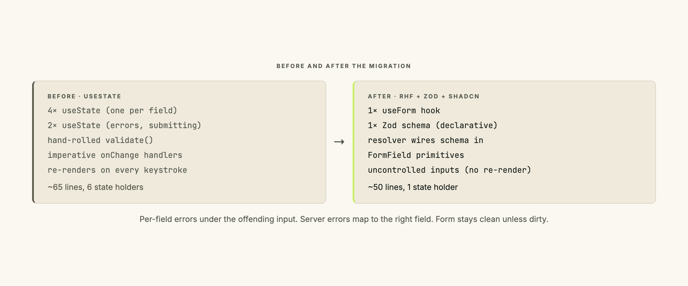
If you have a React app from 2022 or earlier, chances are the forms still use useState. One per field, one onChange handler per field, a custom validate() function that fires on submit. The shape works. It also costs you 80 lines of state plumbing per form and re-renders the entire component tree on every keystroke.
This walkthrough migrates one form to React Hook Form (RHF) plus Zod plus shadcn’s <Form> component. I use a generic “edit profile” form as the running example.
When migration is worth it
useState is fine for forms with three or fewer fields and trivial validation. A login form with email and password. A newsletter signup with one email field. The overhead of RHF and Zod is not worth it for those.
The migration pays off when:
- The form has 5+ fields.
- Validation is non-trivial: cross-field rules, conditional requirements, complex error messages.
- The form has nested objects or array fields.
- You want server-side errors to display under the offending field, not as a global banner.
- Field-level re-renders feel slow because every keystroke triggers a parent re-render.
If any two of those apply, migrate.
The before code
A profile-edit form with name, email, role, and notes. Rules: name required, email required and valid format, role from a fixed list, notes optional but capped at 500 chars.
// EditProfileForm.tsx (before)
import { useState } from 'react';

export function EditProfileForm({ initial, onSave }) {
  const [name, setName] = useState(initial.name);
  const [email, setEmail] = useState(initial.email);
  const [role, setRole] = useState(initial.role);
  const [notes, setNotes] = useState(initial.notes ?? '');
  const [errors, setErrors] = useState({});
  const [submitting, setSubmitting] = useState(false);

  function validate() {
    const errs = {};
    if (!name.trim()) errs.name = 'Name is required.';
    if (!email.trim()) errs.email = 'Email is required.';
    else if (!/^[^\s@]+@[^\s@]+\.[^\s@]+$/.test(email))
      errs.email = 'Email format is invalid.';
    if (!['admin', 'member', 'viewer'].includes(role))
      errs.role = 'Pick a valid role.';
    if (notes.length > 500)
      errs.notes = 'Notes cannot exceed 500 characters.';
    return errs;
  }

  async function handleSubmit(e) {
    e.preventDefault();
    const errs = validate();
    setErrors(errs);
    if (Object.keys(errs).length > 0) return;

    setSubmitting(true);
    try {
      await onSave({ name, email, role, notes });
    } catch (err) {
      setErrors({ form: err.message });
    } finally {
      setSubmitting(false);
    }
  }

  return (
    <form onSubmit={handleSubmit}>
      <label>Name
        <input value={name} onChange={(e) => setName(e.target.value)} />
        {errors.name && <span className="err">{errors.name}</span>}
      </label>
      <label>Email
        <input value={email} onChange={(e) => setEmail(e.target.value)} />
        {errors.email && <span className="err">{errors.email}</span>}
      </label>
      <label>Role
        <select value={role} onChange={(e) => setRole(e.target.value)}>
          <option value="admin">Admin</option>
          <option value="member">Member</option>
          <option value="viewer">Viewer</option>
        </select>
        {errors.role && <span className="err">{errors.role}</span>}
      </label>
      <label>Notes
        <textarea value={notes} onChange={(e) => setNotes(e.target.value)} />
        {errors.notes && <span className="err">{errors.notes}</span>}
      </label>
      {errors.form && <div className="err">{errors.form}</div>}
      <button type="submit" disabled={submitting}>Save</button>
    </form>
  );
}
Four useState calls for fields, two for meta-state, a hand-rolled validator, a homegrown error model. The whole component tree re-renders on every keystroke.
Step 1: install the shadcn Form component
The shadcn Form component is a thin wrapper around RHF’s primitives, styled to match the rest of the shadcn system. Add it once per project:
npx shadcn@latest add formThis drops components/ui/form.tsx into your project with the wrappers (<Form>, <FormField>, <FormItem>, <FormLabel>, <FormControl>, <FormMessage>) ready to use. The add command installs react-hook-form and @hookform/resolvers as well.
Step 2: write the Zod schema and infer the type
The schema replaces the hand-rolled validate() function:
import { z } from 'zod';

export const profileSchema = z.object({
  name: z.string().min(1, 'Name is required.'),
  email: z.string().min(1, 'Email is required.').email('Email format is invalid.'),
  role: z.enum(['admin', 'member', 'viewer'], {
    message: 'Pick a valid role.',
  }),
  notes: z.string().max(500, 'Notes cannot exceed 500 characters.').optional(),
});

export type ProfileInput = z.infer<typeof profileSchema>;
Five lines of schema. Error messages live inside the schema, not scattered through the form. z.infer gives you the TypeScript type for free, so the form props can be typed as ProfileInput without duplicating the shape.
Cross-field validations (confirm password matching password, for instance) go in a .refine() block at the bottom of the schema.
Step 3: replace useState with useForm
useForm: the central React Hook Form hook. It returns aformobject that holds all field state, validation results, and submit handling. NouseStatecalls needed for individual fields.
import { useForm } from 'react-hook-form';
import { zodResolver } from '@hookform/resolvers/zod';
import { profileSchema, type ProfileInput } from '@/schemas/profile';

export function EditProfileForm({ initial, onSave }) {
  const form = useForm<ProfileInput>({
    resolver: zodResolver(profileSchema),
    mode: 'onBlur',
    defaultValues: {
      name: initial.name,
      email: initial.email,
      role: initial.role,
      notes: initial.notes ?? '',
    },
  });

  async function handleSubmit(values: ProfileInput) {
    try {
      await onSave(values);
    } catch (err) {
      form.setError('root', { message: err.message });
    }
  }

  // ... render below
}
resolver: zodResolver(profileSchema) wires the schema in. defaultValues seeds the form with the existing record’s values. The submit handler receives a typed values object that has already passed the schema: no validate() call, no error-state plumbing.
Step 4: wrap fields in <FormField>
import { Form, FormField, FormItem, FormLabel, FormControl, FormMessage } from '@/components/ui/form';
import { Input } from '@/components/ui/input';
import { Select } from '@/components/ui/select';
import { Textarea } from '@/components/ui/textarea';
import { Button } from '@/components/ui/button';

return (
  <Form {...form}>
    <form onSubmit={form.handleSubmit(handleSubmit)}>
      <FormField
        control={form.control}
        name="name"
        render={({ field }) => (
          <FormItem>
            <FormLabel>Name</FormLabel>
            <FormControl><Input {...field} /></FormControl>
            <FormMessage />
          </FormItem>
        )}
      />

      <FormField
        control={form.control}
        name="email"
        render={({ field }) => (
          <FormItem>
            <FormLabel>Email</FormLabel>
            <FormControl><Input type="email" {...field} /></FormControl>
            <FormMessage />
          </FormItem>
        )}
      />

      <FormField
        control={form.control}
        name="role"
        render={({ field }) => (
          <FormItem>
            <FormLabel>Role</FormLabel>
            <Select onValueChange={field.onChange} defaultValue={field.value}>
              <FormControl>
                <SelectTrigger><SelectValue placeholder="Pick a role" /></SelectTrigger>
              </FormControl>
              <SelectContent>
                <SelectItem value="admin">Admin</SelectItem>
                <SelectItem value="member">Member</SelectItem>
                <SelectItem value="viewer">Viewer</SelectItem>
              </SelectContent>
            </Select>
            <FormMessage />
          </FormItem>
        )}
      />

      <FormField
        control={form.control}
        name="notes"
        render={({ field }) => (
          <FormItem>
            <FormLabel>Notes</FormLabel>
            <FormControl><Textarea {...field} /></FormControl>
            <FormMessage />
          </FormItem>
        )}
      />

      {form.formState.errors.root && (
        <p className="err">{form.formState.errors.root.message}</p>
      )}

      <Button type="submit" disabled={form.formState.isSubmitting}>Save</Button>
    </form>
  </Form>
);
Each <FormField> wires a field’s validation, error display, and value handling in one block. <FormMessage /> renders the Zod error for that field automatically. form.formState.isSubmitting replaces the manual submitting state.
Step 5: pick the validation mode
useForm takes a mode option that decides when validation runs:
onSubmit(the default): validation runs only when the user clicks Save. Errors appear all at once.onBlur: validation runs when a field loses focus. Errors appear as the user tabs through.onChange: validation runs on every keystroke.onTouched: likeonBluron first interaction, thenonChangeafter that.
onBlur is the right default for most forms. It does not flag errors while the user is mid-word (which onChange does, and which is annoying for email fields), but it catches mistakes before the user hits Save and reads a wall of red.
onTouched is worth considering for fields that benefit from immediate feedback after the first edit: password strength meters, conditional field reveals. More sophisticated than most teams need.
onSubmit is the least intrusive and is the React default for a reason. On multi-field forms it makes for poor UX because the user only sees errors after committing to the action.
For this profile form I use mode: 'onBlur'. The user finishes typing their name, tabs to email, and the name field flashes red if they left it blank. Fix it, move on.
Step 6: handle the submit
async function handleSubmit(values: ProfileInput) {
  try {
    await onSave(values);
    toast.success('Profile updated.');
    form.reset(values); // Mark the form as clean
  } catch (err) {
    if (err.code === 'EMAIL_TAKEN') {
      form.setError('email', { message: 'Email already in use.' });
    } else {
      form.setError('root', { message: err.message });
    }
  }
}
form.setError('email', { message: ... }) puts the server’s error right under the offending field. The user sees “Email already in use.” below the email input, not in a banner at the top of the form. That’s the UX win that justifies the migration cost.
form.reset(values) after a successful save marks the form clean so form.formState.isDirty goes false. Skip it and the Save button stays lit even after the server confirmed the write.
Gotcha: controlled vs uncontrolled inputs
Uncontrolled input: an input whose value lives in the DOM, not in React state. React Hook Form uses this approach by default, which is why typing in a field does not trigger a component re-render.
When you spread {...field} onto a native <input> or <textarea>, RHF registers the DOM node directly. That works for native inputs and most shadcn primitives.
The problem shows up with components that fight RHF for control of their own value: a custom Select, a date picker, a rich text editor. For those, pass field.onChange and field.value explicitly rather than spreading, or use RHF’s <Controller> wrapper. The shadcn <Select> example above shows the pattern: onValueChange={field.onChange} and defaultValue={field.value} wired in by hand.
Gotcha: default values and reset
defaultValues sets form values once, at mount. If the record changes after mount (you re-fetch after a server update, for instance), the form does not pick up the new values automatically. Call form.reset(newValues) explicitly:
useEffect(() => {
  form.reset({
    name: record.name,
    email: record.email,
    role: record.role,
    notes: record.notes ?? '',
  });
}, [record.id, form]);
One dependency detail: [record.id], not [record]. Any object reference change on record will reset the form mid-edit if you depend on the full object.
Gotcha: server-side errors
form.setError('fieldName', { message }) places the error under the named field. The form stays dirty, the user can fix it and resubmit.
form.setError('root', { message }) is for form-level errors: network failures, generic 500s, anything that does not map to one field. Render it wherever you place form.formState.errors.root.message, usually above the submit button.
One behaviour worth knowing: errors set with setError clear on the next validation pass. Set an email error, user re-edits the email field and blurs, server-side error disappears. That is generally what you want.
Gotcha: nested objects and array fields
Nested objects use dot notation in the field name:
<FormField name="address.street" ... />
<FormField name="address.city" ... />
The Zod schema mirrors the shape:
const schema = z.object({
  address: z.object({
    street: z.string().min(1),
    city: z.string().min(1),
  }),
});
For arrays, use useFieldArray:
const { fields, append, remove } = useFieldArray({
  control: form.control,
  name: 'tags',
});
fields is the array to render; append and remove mutate the list. The schema uses z.array(...) to validate the items. For deep array + object combinations (a list of addresses, each with street and city), useFieldArray composes with dot notation: name={addresses.${index}.street}.
For a single form this migration takes about an hour. An admin dashboard with six forms is a week if you run them in phased migrations with verification gates, two weeks if other priorities interleave. The mode option is documented in the React Hook Form useForm reference.
If you are running a React product where the form layer is still on useState and the maintenance cost is showing, let’s talk.